Modern Admin System
A complete redesign of a back-end admin platform to improve usability, mobile accessibility, and cross-functional efficiency.

The Problem
The existing admin system was functional but outdated, cluttered, and inconsistent. Admins told us they struggled with:
- Managing users and their permissions efficiently.
- Accessing and interpreting data through charts and tables.
- Navigating multiple modules without clear workflows.
- Using the system on mobile devices. Admins needed to work on the go but the platform wasn't responsive.
This slowed down operations, caused mistakes, and limited scalability.
The Solution
Redesign the back-end system to be intuitive, responsive, and scalable, focusing on:
- User Management: Streamlined creation, modification, and deactivation of accounts, with clear visibility into roles and permissions.
- Data Visualization: Interactive charts and tables to make complex system data actionable and easy to interpret.
- Workflow Efficiency: Improved navigation, filtering, and task flows to reduce clicks and cognitive load for admins
- Responsive Design: Ensured that all dashboards, tables, and workflows worked seamlessly on mobile, tablet, and desktop.
- Clarity & Accessibility: Unified design system for clarity, readability, and scalability.
The Responsibilities
- UI Design
- UX Design
- Prototyping & Wireframing
- User Interviews & Testing Facilitation
- Design System Updates
- Responsive Layout Design

The Research & User Insights
I interviewed the admin team to understand pain points and workflow priorities.
Key insights from discovery:
- Permission management was confusing and error-prone.
- Data tables were dense, lacked sorting and filtering options, and were difficult to export.
- Admins needed dashboards with actionable insights.
- Mobile use was becoming increasingly critical, especially for field teams.
These insights guided the wireframes, prototypes, and mobile-first design decisions.

The Wireframing & Prototyping
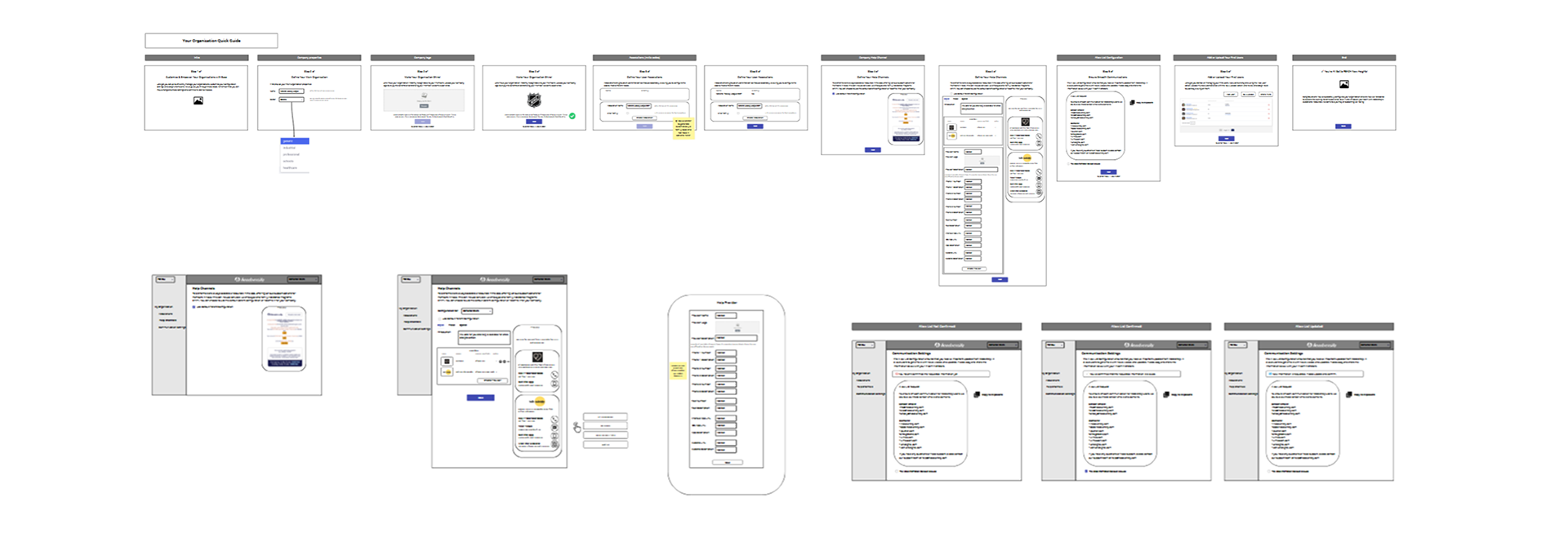
Low-fidelity wireframes in Figma mapped workflows and identified friction points for both desktop and mobile.
High-fidelity interactive prototypes tested:
- User management flows
- Permissions assignment and editing
- Data filtering, sorting, and export in tables
- Dashboard chart interactions
- Mobile responsiveness and touch interactions

The Testing & Validation
Usability testing sessions validated:
- Clarity of navigation and information hierarchy
- Ease of managing users and permissions
- Ability to extract insights quickly from charts and tables
- Smooth mobile experience, ensuring all critical functions were accessible on smaller screens
Feedback led to refinements like:
- Streamlined mobile layouts with collapsible panels
- Simplified multi-step workflows into inline modals for mobile
- Interactive charts adapted for touch gestures

The UI
The final UI emphasizes clarity, efficiency, consistency, and mobile accessibility:
- Modular dashboards for quick access to key metrics
- Interactive charts and tables with sorting, filtering, and export functionality
- Role-based navigation and permission visibility
- Fully responsive design, providing a seamless experience across desktop, tablet, and mobile

The Results & Learnings
The revamped admin system significantly improved efficiency, accuracy, and admin satisfaction:
- Reduced user management errors by 35%.
- Admins completed key tasks 40% faster on average.
- Permissions errors and conflicts decreased substantially.
- Mobile responsiveness allowed field admins to manage workflows anywhere, increasing flexibility.
- Dashboards provided actionable insights, improving operational decision-making.
Learnings:
- Designing complex systems for mobile-first requires careful prioritization of functionality and layout.
- Early and frequent validation with power users prevents costly redesigns.
- A flexible design system is essential for scalability as new features evolve.